On-camera Lighting

On-camera lighting has been bashed, with good reason, by photographers for years. However, it is not always bad. Here are a few of my thoughts about and experiences with it.

Introduction

On-camera lighting refers to a built-in flash or a hot-shoe mounted flash, often called a Speedlight (Nikon) or Speedlite (Canon, Ricoh). This means that the light source is relatively close to the lens.

With the light source close to the lens, this means that there are few shadows, and what shadows there are tend to be small.

Disadvantages

Because of the few and small shadows, everything in the photo looks flat. Shadows show the shape of objects when all you have to work with is two dimensions as opposed to three. For example:

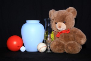
Still life lit with on-camera lighting with three balls, two vases, and a Teddy bear. There are nearly no shadows.
With on-camera lighting, there are few shadows and everything looks flat.

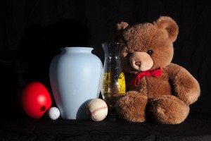
Front-45 degree lighting for a still life with three balls, two vases, and a Teddy bear. Shadows show the shape of objects.
With a light source to the right of the camera, you can see the shape of the objects.

When taking photos of people, on-camera light often results in what is knwon as “red-eye”. This occurs when the flash bounces off of the retina and back to the camera. People tend to look like some kind of alien with a glowing eye. I will have to go create one of these to give as an example.

On-camera lighting used in lower-light situations tends to produce images that have a dark or black background. This is fine if it is what you want, but it can be distracting. I will have to go create one of these to give as an example.

Advantages

On-camera lighting is not completely bad though. It can be used to fill shadows. For example, on a sunny day, you can have your subject facing the sun. This is great for lighting their face, but will make them squint. Instead, turn them around so the sun is behind them. Then turn the flash on. Here are a pair of examples of using front lighting to fill shadows:

Woman with a rose near her head, with on-camera lighting balancing the natural light to fill shadows
This photo of the model Monica Duran shows using a fill flash to soften shadows. The flash was located on a bracket, so it was not in the hot shoe, but about a foot (30cm) away. The flash was set to approximately balance the sunlight which was the other light source for this photo.

woman on rocks with a wave crashing in the background with shadows filled by on-camera lighting
The lovely Monica Moya near a heart made of white coral stones at South Point on the island of Hawaii. Because the sun was setting behind her, I used a flash mounted on a bracket to fill the shadows that would have been there.


As I mentioned above, I tend to use a flash bracket when I want to use front light. My bracket is a Alzo Flip Flash Bracket. They claim it is for Canon cameras, but I see nothing in its construction that makes it Canon-specific. This bracket is heavy, but very versatile. It moves the front light source enough away from the lens to avoid red eye, but it is still close enough to fill the shadows.

Conclusions

On-camera lighting has a well-deserved reputation for making photos look boring and flat. However, it can be useful, when properly balanced with other light sources (a separate blog posting), to fill shadows. Don’t give up on it, but do consider getting a flash bracket to move it far enough away to avoid red eye.

Continuous lights

One option for lighting is continuous lights. These sources of illumination, as their name implies, provide light all the time, as compared with flashes, strobes, speedlights, and/or speedlites with their short burst of light. Continuous lights, like all lighting options, have advantages and disadvantages. The big advantage is the ability to see the effects of the light that illuminates your subject(s). You can set the light direction, character, and relative intensity to what you want, and see that it is correct. In this blog posting, I will talk about my experiences with continuous lights, and their individual pluses and minuses.

Hot lights

In times past, photographers used what were called “hot lights”. These were either high-power incandescent bulbs or one or more banks of them. Due to the technology of incandescent lights, they generate as much or more heat as they do light, hence their name. Some people use lower-priced work lights, similar to what you can get from hardware stores. For example, here is a twin-halogen light on a stand.

The primary difference between something like this and lights designed for photography is that these lights have no built-in support for light modification devices such as soft boxes, flags, grids, etc. They are also not dimmable, so you have to control the intensity by moving them closer or farther away from the subject. Photographic hot lights tend to be more flexible in how you can use them, but you pay more for this capability. For example, this light set uses 600W halogens, and comes with light stands, soft boxes, barn doors, and an umbrella. While there is not a dimmer included, en electrically-minded person could add one for not lots of additional cost.

Hot lights are not very expensive (unless you count the electricity it takes to run them), they provide a lot of light, and they will probably heat your studio at the same time. Not too bad a deal if you are shooting in the winter, but electric heat tends to be one of the more expensive ways of heating. In fact, hot lights are often so hot that you can get a serious burn from reflectors and other modification devices, and they can start fires if something flammable gets too close to them. Because newer technologies are better in terms of power consumption and safety, these types of continuous lights are used less often.

Fluorescent lights

The next lighting technology after incandescent was fluorescent. Early continuous lights of this type were often shunned by photographers due to their poor color characteristics. However, technology improved and the color properties became much better (but at a higher price). Again, some photographers went to a hardware store and purchased inexpensive fixtures and the more expensive daylight-balanced bulbs and created low-cost continuous light sources. Others used more photographically-designed lights.

Fluorescent lights are inexpensive—they are similar in cost to hot lights. They are also far cooler and much more efficient. However, only rarely are they dimmable, which means you control the intensity by changing the light-to-subject distance or the number of lights you are using.

LED arrays

The current lighting technology for continuous lights is light-emitting diodes (LEDs). They are cool and the most efficient form of generating light in common use today. An interesting phenomenon is that they are often combined into arrays that can provide softer light than a small point source. Prices range from inexpensive to jaw-droppingly expensive. They are usually dimmable, and the more expensive ones even have color temperature adjustments.

My personal experience with LED arrays for lighting is that they are inexpensive, flexible, and not very bright compared with the other lights I normally use (studio flashes or speedlights/speedlites). I own two 160-LED arrays and one 500-LED array. The larger array has built-in barn doors for some control of the light. I like that all of them can be battery-operated for several hours. They seem bright until I meter the image. Because I shoot at low ISO settings for image quality (I aim for images that will print well at 2x3ft), my lights do not produce sufficient illumination for hand-held shutter speeds. I could fix this by purchasing more expensive lights, but I tend to use flashes instead.

White balance

I have previously written about white balance, so I will only say here that it is critical to getting accurate color in your resulting photos.

When purchasing a continuous light source for color work, one measure of color quality is to look at the color-rendering index (CRI) which measures how accurate colors will appear to a human eye. This number tells you how well the light source does at accurately rendering color when compared to a standardized daylight (a value of 100). Lower numbers are progressively worse, and some light sources (such as low-pressure sodium lights) have negative CRI values.

The other measure of color is the color temperature, measured as a temperature in degrees Kelvin. The lower the number, the redder the colors are.

Hot lights, in spite of their name tend to be cool (usually in the range of 2800 to 3500K color temperature). This makes them have more red, orange, and yellow tones when compared with daylight. However, because they have a continuous spectrum of light, they usually have a CRI of around 100.

Fluorescent lights have a well-deserved reputation for poor color rendition. These lights often have a light spectrum consisting of only a few spikes of a specific color. The location in the spectrum limits how accurately they can reproduce color for human eyes, and this is reflected in CRI values s low as 50. Better bulbs can approach a CRI of 90. Fluorescent color temperature is also controlled by the phosphors used in the bulb, and they range from around 3000 to 4000K.

LED light quality varies with the quality of the LED. Cheap ones can have poor color quality compared to the more expensive LED light sources. They tend to have a CRI in the range of 80, with the best coming in at 98 (example). More expensive arrays allow you to choose a color temperature.

Remember that mixing different light sources can make getting an accurate white balance difficult or impossible. Sshadows from one light source that are illuminated by another will have a color cast to them if the lights have different color temperatures.

Summary

The big win with continuous lights is the ability to see your lighting before you press the shutter. This means that you can know that it is correct. This knowledge can give you piece of mind. It will save time when setting up photos.

Continuous lights can be inexpensive, making them a good way of starting into lighting. However, when you get to light modification to control what is illuminated and the character of the light, you will find that the more expensive lights tend to have more options for control. Surprise, they are more expensive for a reason. How important this control is to you depends on the photos you take.
Proper exposure: Black, white, or gray?

What does your camera’s meter do with objects of different brightness? Unless you have an unusual camera, it probably tries to get the image to match the standard gray. Lets take a look at what this means in terms of getting the proper exposure for your image.

The problem

First, here are three images of different-brightness items, with true black and white references above. These were all three shot with the camera on automatic exposure mode, so it was picking what it believed was the “correct” exposure.

Black bar
White bar
A gray image (not the proper exposure), only slightly darker than the white posterboard image
A photo of black poster board (with a bit of a bend in it)
A gray image (not the proper exposure), only a little lighter than the black posterboard
A photo of white foam core board. It has a glossy surface, hence the reflected light source.
A WhiBal gray reference card with a proper exposure
A photo of a standard gray card
The camera made the black object gray. While slightly lighter than the black, this white object is gray. Unsurprisingly, the standard gray card (a WhiBal card) is gray.

Looking at the color values in the three images, the black object has RGB values around 155, or about 60%. The white object has RGB values around 180, or about 70%. The WhiBal gray card has RGB values around 155, which is again around 60%. Of the three items, only the gray card had the proper exposure.

What this means is that you need to be aware of the brightness of the items you take photos of. The correct exposure for an item is often not what the camera’s meter tells you. Here are some examples of how things can go wrong:

  • Take a picture of a snowy scene. The brightness of the snow and the sky will be reduced to gray tones when you want them to be at the top of the brightness possibilities.
  • Take a picture of a person with dark skin. The camera will brighten their skin, giving them lighter skin than they really have.
  • Animals that are black or white (e.g., a black cat or a polar bear) will end up more gray than their proper color.

Solutions

OK, so the camera’s meter can be fooled by your photo subject. What can you do about it?

The simplest solution is to use your camera’s exposure compensation controls (Canon, Nikon, Sony, Fuji) to brighten or darken the image and end up with a proper exposure—one that shows dark items as dark and/or light items as bright. Sometimes, this is what I do.

Other times, when I find myself needing more control over the image exposure, I will take more control. First, I have set my camera’s meter to be a spot meter. Not all cameras have this control over metering, but the more capable ones will. This means that I can look at the exposure that the camera is recommending for various parts of the scene I am going to photograph. My camera records 14 bits per color per pixel. For comparison, a normal JPEG image has 8 bits per color per pixel. I look at the various meter values to see if the camera can record the whole scene, from the dark areas to the light areas. If it can, I will set the exposure so that the image is properly exposed.

For example, suppose I was going to take a picture of a dark-skinned person sitting on the grass under a tree in an otherwise brightly-lit scene. I would take meter readings from: the person’s skin, the grass in shadow, the grass in the sun, the leaves on the tree, and the sky (if it was to be in the photo). If the difference in exposure between the darkest and lightest is within 8 to 10 EV, I would go ahead and take the picture. While my camera can record more than this, whenever you get close to the edges of camera capability, image quality is likely to suffer unless you are perfect in your exposure.

If the difference between the bright and dark areas of the scene is too much, I would have to use other techniques, such as adding a fill flash, using a reflector to bring in additional light to the dark areas, or using high dynamic range (HDR). Which of these (or other) alternatives is the correct approach depends on what I am taking a photo of and what additional equipment I have with me.

Another possible solution is to shoot RAW instead of JPEG. Many cameras allow you to capture the raw data from the image sensor, usually called a camera RAW image. If the contrast was not too great, then the camera might have data for detail in the shadows and highlights that might not have made it into the JPEG image it produced. Applying various raw extraction techniques might allow you to recover the missing information.


Finally, you can use an incident light meter. This measures the light arriving on the subject instead of the light reflected back to it (which a camera meter measures). They tend to be expensive, but everybody I have met who uses one swears by them.

Conclusion

Your camera’s meter tries to make everything have the same level of brightness. If you want to get a proper exposure, you need to be aware of this and take steps to get it. Solutions to the problem include exposure compensation controls, manual metering and planning of the exposure, or getting extra data from the RAW file.

Outdoor Daytime Flash Photography

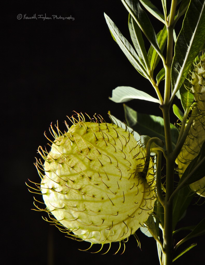
I never go outdoors to take photos in the daytime without at least one flash, often two. Sometimes I use it (temporarily) overpower the sun so I can control the light. For example, here is a photo of a milkweed (Asclepias sp.) seed pod that I took in the middle of the day near Naahelu, Hawaii:

milkweed pod with a black background
I took this photo of the milkweed seed pod in the middle of the day. By using my flash to overpower the sun, I could get a black background. Backlighting also makes it glow.

Notice the black background. I had my camera set to ISO 160, 1/640 sec, and f16. This exposure was such that the sun was providing none of the light for the image. In other words, I was using daytime flash to overpower the sun. I had my voice-activated light stand (my wife in this case) hold the flash just outside of the frame. I was also using high-speed sync (HSS) to allow me to use such a fast shutter speed. I have two ways of using HSS. One way is to use a flash extension cable to allow me to move the flash off the camera, yet still keep all of the communication between the flash and camera. I use this Canon OC-E3 cable, but equivalent cables exist for Nikon and many other camera brands. The other option I might have used is the Pocketwizard MiniTT1 and TT5, which also allows HSS. I do not remember which approach I used for this photo.

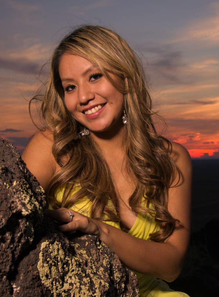
Besides being able to get a black background, using a flash in the daytime can allow you to highlight a person, so they are brighter than the sky (as a way of guiding the viewer’s eye to them). For example, here is the lovely Tasheena at sunset:

woman with a sunset behind her
I used a flash to light Tasheena so she was slightly brighter than the setting sun behind her.

How I took this photo was to use the camera’s meter to identify the proper exposure for the sunset. I set the camera so the sunset would be slightly under-exposed (by about one stop). Then I used my flash to properly expose Tasheena, and the result is the photo you see here.

Next time you head outside to take photos, take a speedlight/speedlite and do some outdoor daytime flash photography.

White balance

Getting the color right in a photo is important. All of the light(s) that provide illumination for the photo have a color. If we take sunlight at noon as the standard, then electronic flashes are often a little more “blue”. The same is true for photos taken in the shade—much of the light is coming from the sky, which is blue. However, at sunrise and sunset, the sunlight is more red-orange, depending on the time and how much dust is in the air. Incandescent lights are much more yellow-orange. Florescent lights can have different colors, but they often have a strong green component.

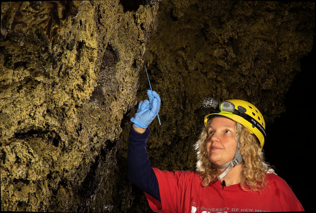
Here is an example. First, a photo with a correct white balance:

Diana Northup doing microbial sampling in a cave
This photo has close to correct white balance.

The result can look like these photos:

photo with a blue cast to illustrate what can happen with an incorrect white balance photo with a magenta cast to illustrate what can happen with an incorrect white balance photo with a green cast to illustrate what can happen with an incorrect white balance photo with a yellow cast to illustrate what can happen with an incorrect white balance
This photo has a white balance that gives everything a blue cast. Note that the microbes on the wall are not yellow as they should be, and Diana’s skin tone is also wrong. This photo has a white balance that gives everything a magenta cast. Note that the microbes on the wall are barely yellow, and Diana’s skin tone is also wrong. A magenta cast means that there is not enough green. This photo has a white balance that gives everything a green cast. Note that the microbes on the wall are the wrong shade of yellow, and Diana’s skin tone is also wrong. This photo has a white balance that gives everything a yellow cast. Note that the microbes on the wall are too yellow, and Diana’s skin tone is also wrong.

If you are not seeing a difference, or if what you see does not match the description, then you need to color-calibrate your monitor. That is a subject for a future blog post.

a collection of camera icons for different white balance settings
Most cameras have icons similar to these somewhere in their settings.
Most digital cameras have a way of telling it at least approximately what to expect in terms of the color of the light. These will work reasonably well, as long as your light sources all have the same color. The hard part (for me, at least) is remembering to change the white balance setting.

Most digital cameras also have an “automatic” setting. The problem with this setting is that they try to calculate the white balance. How well they do depends on how close your photo is to the ones that the software understands. A photo of uncle George might be OK, no matter the light source. However, a photo of a lungfish probably has very little in common with uncle George (however, I’ve never met him to know for sure :-). This means that the camera’s program running to calculate the white balance is probably not going to do a good job.

What this means is that, assuming correct color is important, you need to use some kind of a standard to ensure that your colors are correct. I use one of two standards. My primary standard for science photography, especially in caves or other hard environments, is the WhiBal card. This card is a guaranteed neutral gray, and the (lack of) color goes through the entire card—it is not a paint or dye. This means that it can be scratched or otherwise abused, and it will probably not only survive, but also still be the correct color. I accidentally put one of mine through an autoclave. It came out very warped, but a little time in a warm oven flattened it out again.

The second standard that I use is a X-Rite ColorChecker Passport.
This standard not only has guaranteed gray, but also standard color patches and patches for making the color warmer or cooler than standard. When I photograph people, I often use the color balance to add a bit of warmth, which usually looks a little more flattering than perfect color.

To use one of these standards, I take a photo that includes the standard, using the same lighting that I will use for the real photo. I shoot in RAW mode, which means that I need to do white balance adjustments as a part of extracting the image from the RAW file. On the computer, I open the image containing the standard. Many software packages make it a simple with one- or two-clicks to do the setting. Once the proper white balance adjustment is determined from the standard, the software allows you to apply the same correction to other images with at most a click or two. In other words, applying a white balance correction is easy.

The result of this is that the photos I produce have correct color. And, it is not hard to do.

How I look at a photo

I’m a bit of a photo-geek, prone to over-analyzing things.  One thing I do is to mindfully look at photos, whether they are my photos or someone else’s. This blog post describes how I look at a photo.

Gestalt

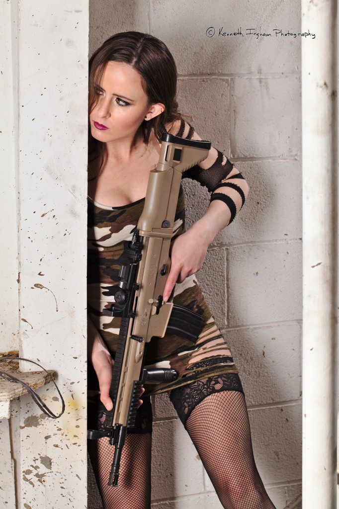
When I look at a photo, the first thing I do is to just get a gestalt of the whole photo.  Is it color, b&w, or some other type of monochrome such as sepia?    Is there an obvious point of interest (more on this in a moment)?  What is this photo trying to show?  I believe that every photo should tell at least a small story.  This means that I should know what the story is when I look at the photo.  This does not mean that I think that the photo has to tell all aspects of the story.  It is fine to leave the viewer imagining what happens next, to let the complete part of the story in their mind.  However, what is the purpose of a photo without something to show?  Why waste the viewer’s time?

For example:

Woman in an old industrial building holding a gun, looking around the corner
This picture tells part of a story, but leaves the viewer to fill in many of the details. Is she the hunter or the hunted? How did she end up in this place? This photo features the lovely Corissa Scroggie.

Eye movement

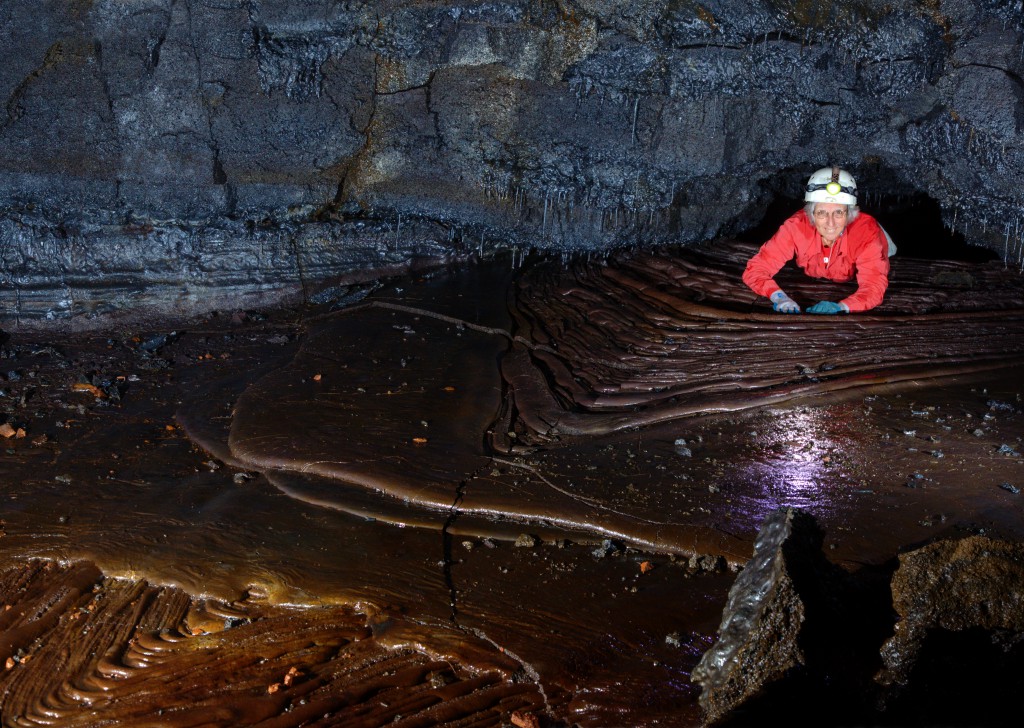
When looking at a photo, I observe how my eye moves as I look at the photo.  Where does it enter the photo?  How does it move within the photo?  Does something in the photo lead my eye out of the frame?  I normally want my photos to lead the viewer’s eye somewhere in the photo, and not lead them out of the photo.  After all, if I lead them out of the photo, they might be done looking at it.  How to lead the viewer’s eye is the subject of another blog entry. However, here is a photo that uses the chevrons in the lava (arrow-like features) to point at the woman coming through the hole. Look at it and see where your eye ends up.

womain crawling through a small hole into the room where the photographer is
This caver is coming through a small hole from a different room. The patterns in the lava and her red shirt draw the eye to her. This image features my friend Deb Ward in a cave on the island of Hawai`i.

Technical Details

After I have been mindful of my viewing to this point, I might look at the technical details.  For example, I look at the focus issues; what is in focus and what is not?  This could be identifying the depth-of-field.  It could be looking at sharp and soft focus areas.  It could be looking at motion blur.  All of these can be used for artistic purposes, or they could be technical mistakes.  For my photos, if these are mistakes, the photo goes away.  There is no reason to show anybody any of my photos with mistakes in them unless I am teaching a class and what to show what can go wrong.

Another technical issue I look at is lighting.  I identify the light source(s) by looking at shadows and mentally calculating where the light needs to be to produce that shadow.  I also look at the character of the light: how hard or soft are each of the sources?  Does one light source have a different color from the others?  Details of each of these points will also appear in upcoming blog entries.

Why be mindful when you look at a photo?

For a photo I really like, looking at it can take me several minutes at least.  However, being aware of how I look at a photo also means that when I plan a photo to take, I take all of these factors into account.  I feel that this means my photos are more interesting. If you are not already looking at photos in a mindful way, try it and see how your photography changes.

Workflow

Much has been written about workflow for photographers. There are even applications that claim to help you organize your workflow. Here is a description of my current workflow and a short description of the tools I use in my workflow.

My camera records the images in RAW mode. Even if you do not know how to do raw processing, it is a good idea to record this way. I can go back and do raw processing for photos that I took years ago, before I understood the possibilities of raw, because my camera was recording the data and I saved it.

My goal in the photography is to get the photo in the camera as close to the final version as possible. In general, it takes more time to deal with something in post processing than at the beginning. For example, when I take photos of models, I ask the makeup artist to be sure to cover any blemishes. This takes only a few minutes of makeup time. However, when multiplied by all of the photos that we take, the time to fix a zit adds up. For a friend’s wedding I photographed, I got to know every zit on everybody, because I went through removing them in several hundred photos. This was hours of zit removal. It is a good thing that she is a special friend. I would not do this for just anybody unless they were paying me by the hour.

When I get to my computer, I copy the photos off of the memory card and onto my computer. I then do a backup. Before anything else happens, I want to know that the pictures exist in at least two places. Later, they will be backed up again and end up in at least four places. My paranoia is justified, because many disk drives have failed on me. However, I rarely lose much, if any, data in a disk failure because of my backup paranoia. Disk space is cheap.

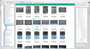
screen shot of digiKam in my workflow
Using digiKam to sort images into Best and Rest
Once I have the photos backed up, I use digiKam and sometimes gwenview to do my first cut. I tend to be pretty brutal in this cut. I delete the photos that are blurry, exposed too badly to recover from the raw, etc. The other photos that do not make the cut go into a folder named “Rest”, and they will be archived. Rarely do I find myself needing to access them again, although they are useful for demonstrating what not to do. Also, sometimes I later decide that a photo is worth some extra work.

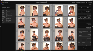
darktable screen shot from my workflow showing photos of a woman in different poses
A screen shot of using darktable for raw file processing. In this case, the photos are of Katt W.
Now, I have decided on what photos I like, and therefore what photos will get further attention. I switch tools and open the raw files in darktable, my primary raw conversion tool. I have used UFRaw combined with the GIMP, and also AfterShot Pro II (a commercial product). However, I have yet to find anything that gives me more of what I want for raw processing than darktable.

In darktable, I set the proper white balance, adjust brightness, contrast, and similar exposure adjustments. I might rotate the image to straighten it and crop the image if needed. I also do simple sensor dust removal if required (another thing that is much faster to deal with by keeping a clean sensor). In many cases, this is all I do to the photo, and I have spent, at most, five minutes. After all, I was working really hard to ensure that the photo was good in the camera. In this case, I export a JPEG image for general use. Darktable stores its adjustments in a .xmp sidecar file, similar to many other programs. This means that the adjustments are non-destructive and nothing is modifying the original RAW file.

For some photos, I use darktable to add a watermark, and I export the watermarked photo at a reduced resolution for use on social media. Since I assume that my photos will be stolen whenever they appear on the web, I use the watermark so I at least get credit for the photo. A person skilled in photo editing can remove the watermark. However, if they are willing to go to that work for a screen-resolution image, they need to get a life. In non-commercial situations, I normally give permission for use when asked, so they are spending more time on the image theft than they would if they were honorable.

If additional editing is needed, it is time to switch to the GIMP. In this case, I will export a TIFF image from darktable, and that is what I open for editing. The GIMP supports layers and all the types of editing you can do in Photoshop. This is where I remove zits, soften wrinkles, and do editing such as removing objects from a photo. I save the file in the GIMP’s native format (.xcf), as well as exporting a JPEG for general use.

Now that I am happy with the processed images, I go back to digiKam. All of my photos get a title and caption. I also add keywords (tags), and add my copyright information into the file’s metadata. Again, this helps to know where my photos are used when they are stolen. It also helps honest people contact me to ask for permission, since my contact info appears in the metadata of every photo.

At this point, I am done. If the photos are for a customer, I upload them to a password-protected page on my web site and send the customer a message with instructions on how to get the photos. I also do another backup or two.

You might have noticed that everything that I list above is open-source software. This means that (a) it is free (as in both beer and speech), and (b) probably better-supported than most commercial software. Given that my image-processing computer is running OpenSUSE, a flavor of the GNU/Linux system, these are nearly the only choices. The good news is that digiKam beats any other software for its tagging—I have tried them all, and there is absolutely nothing that is better. Few even come close. Darktable and the GIMP are easily the equal of their commercial competition. In fact, university research into new image processing algorithms occurs in open source programs and then ends up in commercial products such as Photoshop. Admittedly, Adobe has their own research team. However, any good ideas rapidly propagate into the open-source alternatives.

Working with lungfish

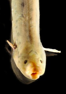
lungfish breathing
Lungfish in the lab of Dr. Irene Salinas, UNM Biology Department
I donated a half-day of science photography to be sold as a fund raiser on the recent UNM Biology Department Research Day. It was sold to Dr. Irene Salinas who studies immune responses in lungfish.

To deliver my promised photography took several steps. First, I set up a time to meet her to see the environment where I would be working. She showed me her lab, and we discussed what she wanted to show in the photos. This is a critical part. If I do not understand what is important, I cannot ensure that the photo shows it. In this case, the primary subject is the fish, and the fact that they come to the surface to breathe. Secondarily, I would take photos of her and her postdoc doing work with them.

While I have photographed through water in the past, this is not a type of photo that I normally take. I spent a few hours reading on the Internet about how to take photos of fish. The biggest problem is chromatic aberration caused by the light going across the air/glass, glass/water and air/water boundaries. This causes color fringes on the edges of things like the fish. It also causes the image to be fuzzy, because the different colors come to a focus at different places, some in front of, some on, and some behind the camera sensor. I am glad that I did this research, because I was aware of the problem and the solution—keep the sensor parallel to the glass or water surface.

For the actual photography, I showed up with a full studio’s worth of lighting equipment. It actually ended up being relatively simple, with two radio-slaved flashes (speedlights or speedlites depending on your camera maker). I put the flashes on simple stands on the table so their light came in from two sides of the aquarium which was also on the table. Because the table was more-or-less white, we put the aquarium on a piece of black foam-core, and we put another piece behind the aquarium. This way, I could get a black background for the photos. When we did the photos showing people working with the fish, I did set up a pair of softboxes on light stands to have some nice soft light to make the researchers look their best.

A gray card in an aquarium
The WhiBal card” in the aquarium. You can also see some of the packing dust and some bubbles in this image.
My first photos, before any fish were added to the water, was of a WhiBal card in the aquarium with the water already added. This guaranteed-gray card allows me to adjust the colors so they are correct in the final image. The really important thing for this photo shoot is that the card can be put into the water so the lighting conditions are identical to the fish photos. Not all color standards can handle this.

lungfish and light-colored dust against a black background
You can see all the packing dust on the bottom of the aquarium. This was a real pain in terms of requiring editing to remove it.
One problem I had not expected was that the aquarium was new. While this was good from a glass clarity perspective, there was a lot of dust from the packing material that we had not expected, and it showed in the photos. Most of it settled to the bottom of the tank, but any time it was disturbed, the flashes lit it causing distracting out-of-focus blobs. I can remove the dust in post-processing, but it takes time. And, nothing can deal with removing one of these blobs in front of the fish; while cloning from somewhere else is OK in a fashion shoot, it is not acceptable for a science photo.

When we were done taking the photos (including a few of Dr. Salinas and her postdoc), I packed up and left. However, my work is not yet done.

The next task for me is to do photo processing. This means the following tasks:

  1. Doing the “best/rest” cut, where I decide what photos I am happy with, which need to be removed, and which are not my favorites, but I will keep them in case there is some need in the future. So far, the “rest” photos have been mainly useful when I give talks or teach photography classes. They can be a good example of what can go wrong with a photo. When paired with a good version, the difference is clear. However, I am brutal with the cut, and sometimes a photo that can be rescued with extra editing does a better job of showing the science. I therefore keep these photos in case the scientist needs them.
  2. Setting the white balance to be correct for all of the photos.
  3. Working from the raw file (not a JPEG), adjusting things such as levels, brightness, contrast, etc so that the photo shows what it needs to.
  4. When necessary, doing detailed fixes using the GIMP. In this case, I removed the dust from some of the photos. I normally work really hard to get the photo right in the camera and keep the amount of this type of editing to a minimum. This editing can easily end up taking a lot of time. Given that my donation was for only a half-day of total time, I have little room for lots of editing.
  5. Uploading the photos to a password-protected, non-public customer download area on my web site, and then sending email to Dr. Salinas to let her know that the photos are ready for her.

This completes the work for a science-in-action photo set (science photography). If the researcher has given her or his permission, the only step remaining is to update my web site and/or blog with an example of some of my latest work. You can see a finished photo of a lungfish at the top of this blog posting.

Who takes the photo, you or the camera?

One of the most baffling questions I get when someone looks at one of my photos is, “What type of camera do you use?”.  To me, this question is akin to asking a painter what brand of brushes they used when painting or asking a writer what brand of computer they use when writing.  It is true that I use a professional-level camera with high-quality lenses.  However, several companies make cameras that I could use to produce my images.  The fact that I am using Canon is based on a decision I made several years ago.  One you invest in a camera system, you are pretty much stuck there unless you are willing to take a financial hit selling it all to change brands.  From my perspective, Nikon makes equally good cameras, and, had things been different several years ago, I might have been using them today.

Returning to the topic of this post, I want to point out that the camera, while important for taking photos, is but a small part of the whole process.  I choose when to push the shutter.  Before or after, and the photo would have been different.  While I do consult with the camera, I am the one who chooses the exposure.  After all, the camera wants to make things 18% gray. If I am taking photos of snow, it needs to be white.  Shadows and lava need to be dark.  I choose whether or not to use fill flash.  I choose what depth-of-field I want.  I choose if Iwant motion blur or if I want to stop the motion.  I choose the framing for the photo.  If I am taking a photo of a person, I normally choose a pose that shows what Iwant about the person in the photo.  I also use supplemental lighting, again to show what I want to show in the final picture.  While I try really hard to get the photo to be correct in the camera, but most photos get at least minor editing to, for example,  bring up detail in the shadows if that is what I want the photo to show..

What all of this means is that my camera is the tool I use to produce the photos.  So, next time you see me, instead of asking about my camera, ask me something about the photo.

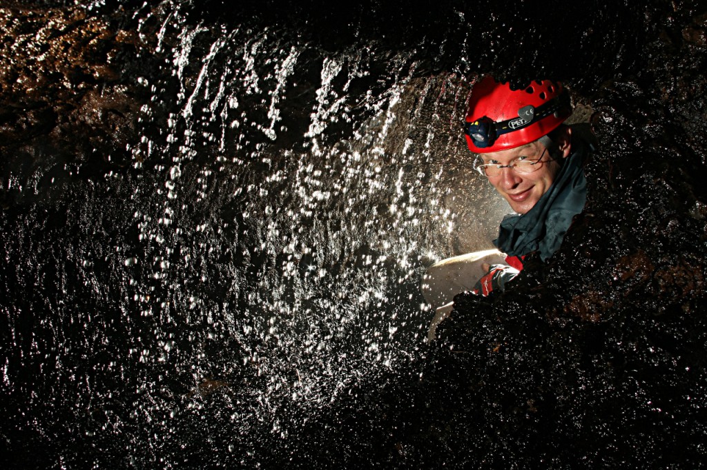
Here is a photo I took in a lava cave in the Azores. I had a slaved flash firing from behind Airidas to light the water, and another slaved flash lighting his face. The camera did not place the flashes, although it did fire them simultaneously. Also, I took this photo in manual mode, which means I selected ISO 200, 1/250s shutter and f11 aperture. The camera I was using was a Canon 40D with a Canon EF 28-135mm lens set on 28mm (another decision I made, not the camera).

man behind waterfall
Airidas behind a waterfall in a lave cave in the Azores. Lit from behind and in front by radio slaved flashes.

Assignment: triangles

In the irregular postings of photo assignment walks, today’s topic is on triangles. I went for an hour walk, looking for triangles. They are relatively easy to spot, but getting a good photo brought me back to the theme that a photo should clearly show the one idea that you are trying to present. I’ll start with a few duds and then move to the better examples.

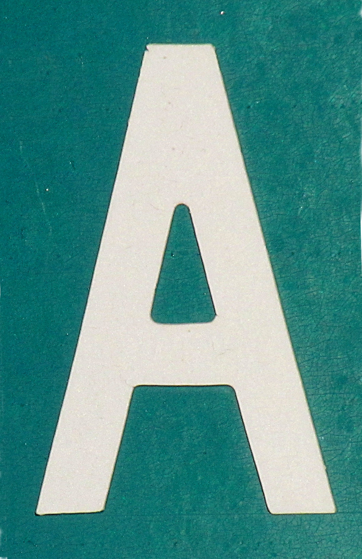
"A" from a street sign
What do you see here, an “A” or a triangle? Due to a lifetime of training, it is harder to see the abstract shape because there is a meaning to the shape. People from an area where the alphabet does not contain this shape would have an easier time seeing the triangle.
Car wheel with triangular shapes in the wheel
Since I was looking for triangles, I saw them. Upon looking at the resulting photo though, the circle dominates.
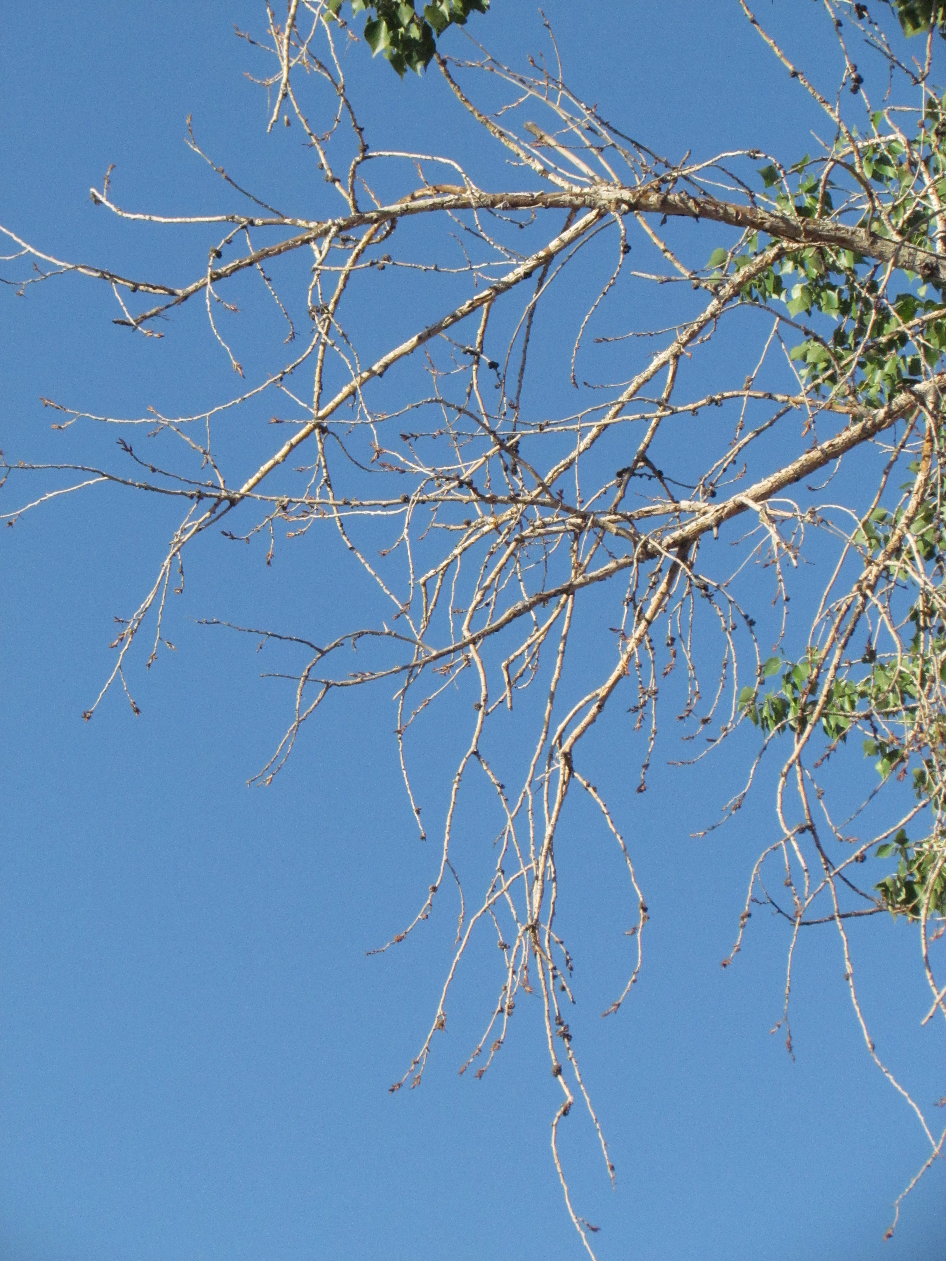
tabgle of branches in a cottonwood
At the extreme of bad, the triangle(s) in this image completely get lost.
utility pole and power lines
This is an example that better shows the concept of “triangle”.
triangles on a concrete sound wall
These are also clear triangles in a simple composition.

At the conclusion of this walk, I might see triangles more now. While I already knew that a photo has to do a good job of conveying the idea I am presenting, this exercise really reinforced this concept. It is why I regularly ask myself, “What am I trying to show with this picture?”. I can then use the answer to choose how to compose and expose the image.