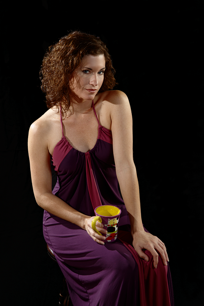
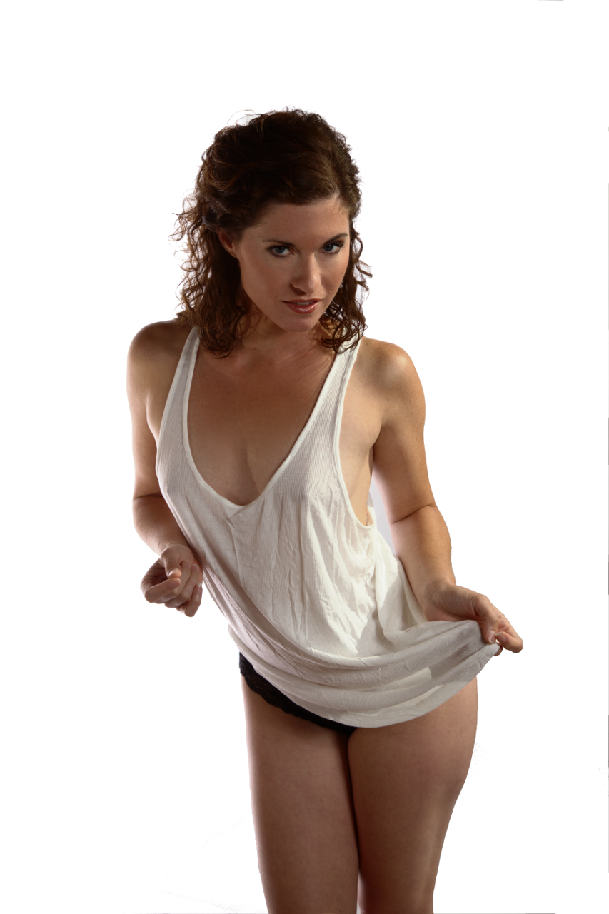
Recently I shot Candace Nirvana. This was a chance to try out my new backdrops, fixing problems with my earlier backdrops. The backdrops were commercial ones, purchased from the Backdrop Outlet. I tried both black and white ones.
Both worked far better than the muslin I had tried earlier. I could get the black one to go completely black, and the white to be completely burned out. These were good improvements.

I did have to ensure that I had a hair light from above and behind to make sure that her hair was separated from the backdrop. Dark hair on a light-skinned model makes for more of challenge due to the contrast. Add to this the need to not lose the hair in the background, and the lighting is not trivial.
For this image, there are four lights: The primary lights are a “softbox” created by placing a diffuser in front of a flash that is left and forward of her, and an umbrella forward, right, and above her. The secondary lights are two hair lights above and behind her on the left and right. Each light that is added is one more that has to be balanced with all the others, so the complexity is higher than I would have liked. Also, in spite of all of the lights and softeners, I still had harder shadows than I would have liked. For example, look at her hair shadows on the right side of her face (her right).
Another point I learned was that I really need to be able to mount lights on the crossbar of the backdrop holder. Then, I could have used a single light with a grid as a hair light.

I also worked with my white backdrop. If I lit it, I could burn it out, creating a solid white background, which makes darker hair easy to work with. However, I was getting a lot of reflected light from the backdrop onto her skin, which was a different challenge. I could have moved her forward, but the backdrop only came so far (I should have invested in the larger one…). For photos like this one, it would have been an acceptable solution, because I was not showing her feet.
A white shirt and a white backdrop makes for a challenge when trying to avoid burning out the shirt while doing just that with the backdrop.
Lighting the backdrop with fewer reflections onto the model would have been easier with barn doors or something similar on the backdrop lights.
One final issue was wrinkles. Both the black and the white backdrops had wrinkles in them from being folded. They did show up in the pictures, which makes more work for me since I want a smooth background. Both of the images on this page had visible wrinkles that I took out. Next time, I’ll try dampening them and putting them in a cool dryer to see if that helps. I guess I could break out a iron as well. Anybody have other ideas?
